Dark mode and light mode
Every app, website or computer system that we work with on a daily basis uses the most common way for the user interface, which is the so called light mode. But, increasingly, a new mode known as dark mode is being promoted.
What is dark mode and light mode?
The dark mode is the way to display an application or web page on the screen of different devices with white text and dark background. The traditional way, which is the light mode, is the opposite, the dark text is displayed on a light background.
There are several factors that can influence the choice of dark mode or light mode. Factors such as the vision of each person, the work environment, the different devices or the design of the interface make each user opt for one mode or another.
It is up to the users themselves to choose which mode we are more comfortable working in and have less eyestrain.
We have incorporated the dark mode or light mode function in the TuCalendi interface so that you can select the one that best suits you. Switching between light and dark mode is very easy.
After logging in with your TuCalendi username and password you will access the dashboard.
At the top right of the screen you will find the following options:
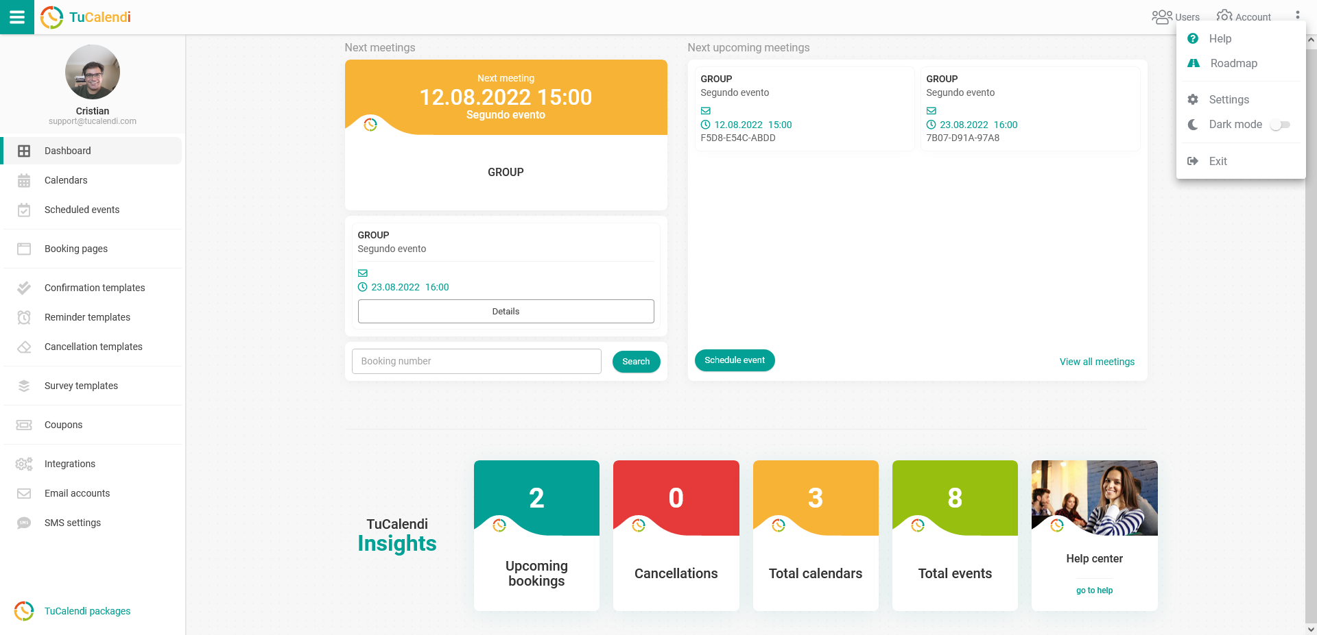
![]() Click on the three vertical dots and a menu will open:
Click on the three vertical dots and a menu will open:

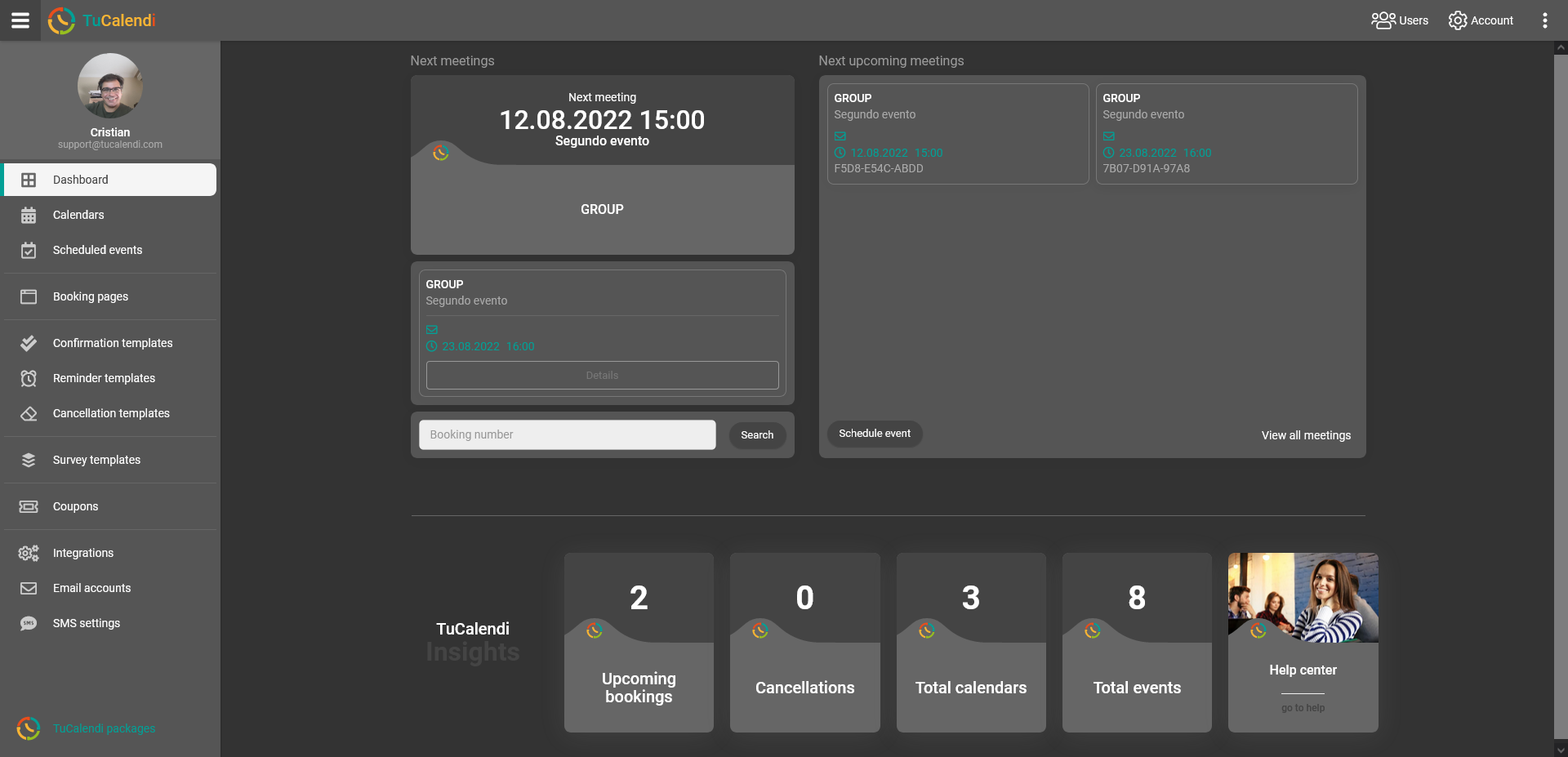
Simply turn on dark mode and the TuCalendi interface will look like this:

Now you are the one who can choose how TuCalendi is displayed.